Step 3
This is for me the most important step when working with reference photos in high resolution, such as those found on the site mentioned above. The photos in high resolution allows us to use only portions of a nice picture (you should try to use photos in proper way and get the best from them – in order to understand what I’m saying to you, try to go to site www.photo-reference-for-comic-artists.com and find a section with free sample images with which you can try to do these various adjustments and tests described further in this tutorial).

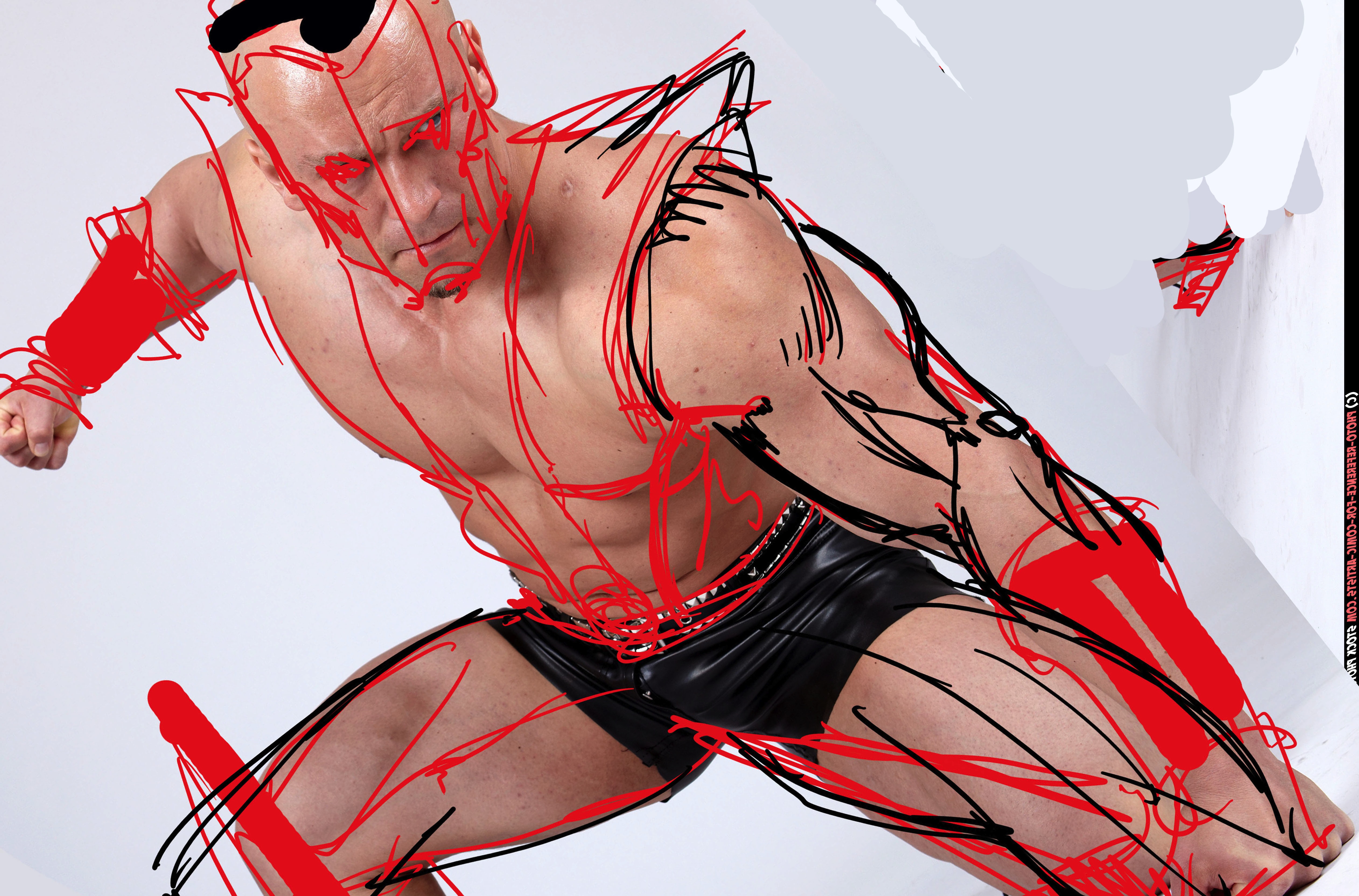
Load your pictures in Photoshop and enlarge the images to 100% of their original size, to understand that the quality of the picture seen in full resolution make interesting images even in the simple details! I love to work on a few areas, like run of the “Crop”. Another interesting thing may be to combine different images, such as faces or hands often use other than the original model, but tried to keep faith with the original poses for what concerns anatomy and lights. Still a useful thing to draw super heroes with reference photos, you often need to change the size of the face and hands of models original … In general, super heroes, they have very muscular bodies and some forms are exasperated by lowering the size of the head accentuate the muscles of the body.

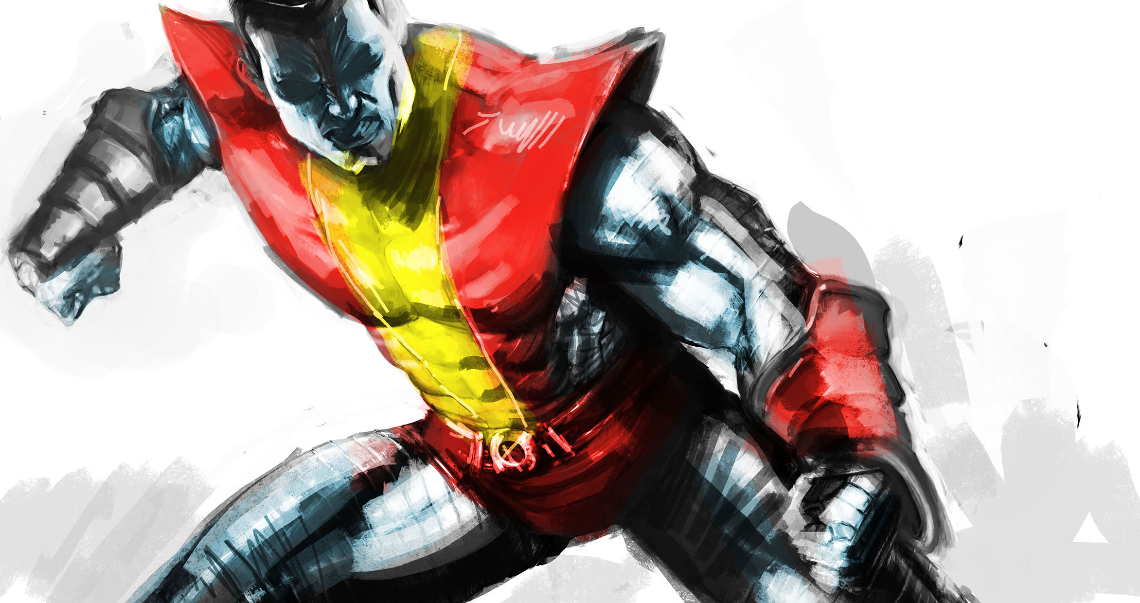
This is the stage of Concept, once set the reference image on a new layer in photoshop, always quickly trace the lines on the photo to set main character, especially the costume, and then imposed on a new layer the color in a very simple only full colors, and a few touches of light and shadow. This procedure is used to set the table and see if the character works. After setting this stage, my advice is to save the image as JPG, and look at small sizes very small, say icon. If this works we can proceed to step of real drawing.
Step 4
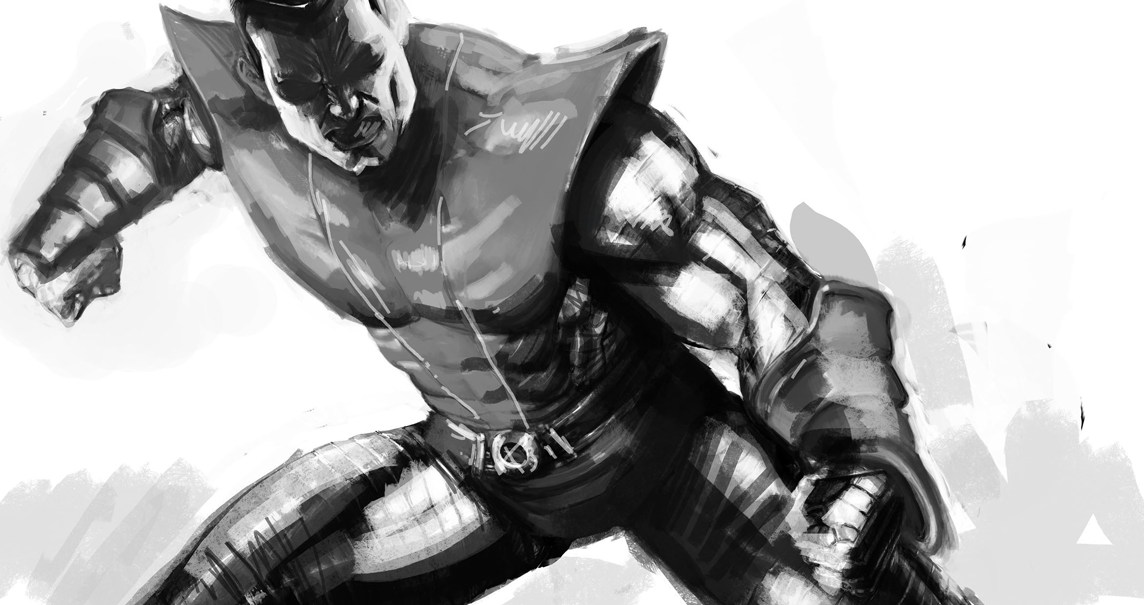
This step of final design is very complicated, in the sense that many tricks do not exist, we must have a good knowledge of painting technique and color, and have a skill in being able to draw well. The basic rule in my opinion is to learn to look at, to draw well, you have to observe carefully the shapes and volumes, the rest is math. For mathematics mean that if the forms are correct, accurate reports, the rest of the table is given by the lights and shadows that create volume effect and credibility of the design. These are basic rules of design. X-Colossus I started retracing some guidelines from photo reference, then I changed the muscles by increasing the volume of the muscles, this on a new layer. Then I created a new layer and created a base in grayscale with a large, soft brush, to achieve the main volumes. then always grayscale, I tried to give a better detail forms. A very useful thing in photoshop to get the grayscale with strong clear and strong dark, is to use two separate layers on top of the base. The level for the dark tones of the imposed and multiply that by the tint imposed in the overlay. This is really useful!
After finishing the gray scale, of a new layer step the full color by setting the blending mode to Multiply or Color, depending on the color tones. This feature will be useful because the color you spend on the new layer set to Multiply is able to read the grayscale’s underneath. In this way, through the full color you will get all the nuances necessary to have the volumes! Now on a new layer, you continue to draw, this time leaving the layer set to normal, with a lot of patience to draw everything that you need to draw.
When the drawing color is in the final stage, repeat the operation to create two separate levels one for lights and one for the shadows always set to Multiply for dark tones and overlay the light ones. It’s important when using these two levels, avoid the use of color, just a shade of gray medium to get all the shades you want, and that’s a very clear pale yellow tone in order to have all the lights in the most beautiful overlay. Having done this way to texture, typically used for dirty work, to create vague patches that help to make the board more credible. I like to use dirty texture, such as use of photos of metals, aluminum, steel, satin finish, rust, but depends heavily on the subject, and from ‘effect that you want. My advice is to use the texture desaturated, black and white is not a problem with the colors of the table. The type of merger with which to apply the texture depends on the tones of the same, can be a lighten, or overlay, but also a colored Dodge, depends … It’s important that the opacity level is low, otherwise it becomes too present and threatens to ruin the image. When everything is finished up to the finishing touches, I like to put lots of details and in some places I post a Glow light through the filters of photoshop. Then step to the phase of color correction, save the image, et Volia, the job is finished.
Pages: 1 2


Latest Comments