“Transformers” by Alon Chou
Problem solving for Optimus Prime
The biggest problem I came across with Optimus Prime was handling his appearance and comparing my design to the originals. I took two pictures for comparison ,
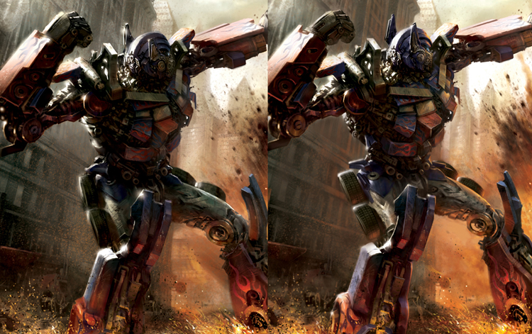
the left one was before and the right one was after. Originally Prime was not as eye catching as I wanted him to be, and that really bothered me. Except moving him closer to the middle, there were a lot more problems needed to be solved:
.: The look :.
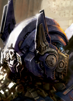
First was the look. Prime’s outline was definitely the key point, it would determine whether he looks like Prime or not. His waist and thigh on the left side are thicker. His broad shoulders thin waist, the curves of his thigh, these are also need to be indicated. His ears seemed a little short, so in the right picture I did some adjustments, which became closer to the original design.
.: The lighting :.
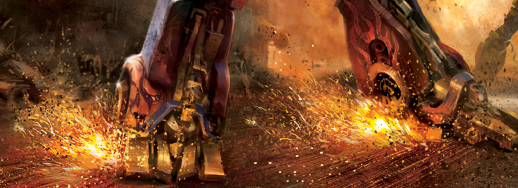
Secondly was the design of light and shadow, the shadow has to effectively push the main character out from the background. I purposely painted a white highlight on Prime’s left side, not only giving him a more 3-dimensional look, but also adding the metal tone to it. Also pay attention to the reflection under the feet, which is another key point. The head was too dark before, so I increased the brightness, also brought in the light of the flame from explosion to add more contrast, making his head more noticeable. The glass on Prime’s chest should have a more brighter reflect, and I emphasized the contrast more on the chest, giving it a better perspective.
.: The flame tattoo :.
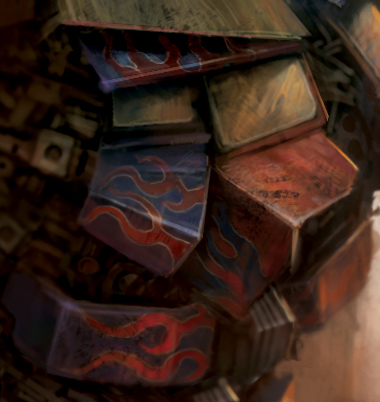
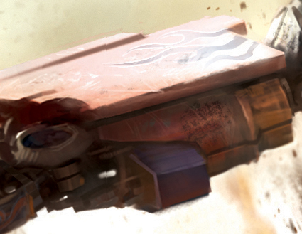
On the flame tattoo part, the character designs for propaganda use was different from the public still photographs from the film, and even the designs of the tattoo were not always the same. In the film Prime has the tattoo on his arm, but on the poster he doesn’t. Some flame tattoos have white outlines and some don’t, so I picked the one with white outline to make the picture more interesting.
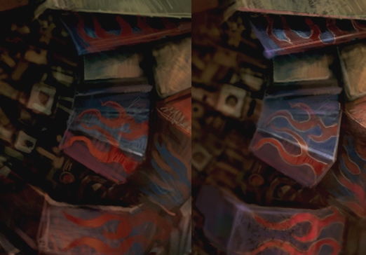
Polishing up the details
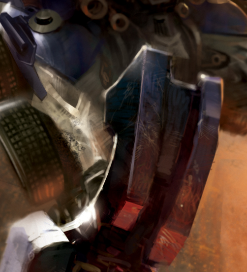
When working on the details, I used very small brush from the scratches on the metals. Adding stains would also make objects more realistic. And by filling objects with brush strokes would enrich the picture, also catches audiences’ attention. Usually default brushes would be enough for me.
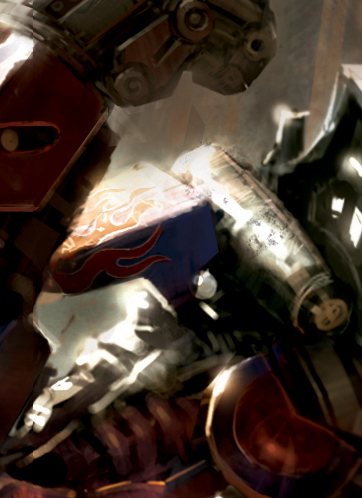
On the flakes part, except using small brush for the jumping sparks, I would also use brushes that have many tiny dots to give it a spurting feeling in motion.


Latest Comments