“Lighting and Shadow basics – part 1 ” by Montree T.
For example, skylight will influence a room with a large window or opening the most as the skylight (a kind of area light) will scatter around a large portion of the room or even throughout the entire room. So if the wall is a white or cream color, the ambient color should be blue(skylight) + white or cream which results in a yellow-green color. Also, don’t forget to dim down the intensity of the color. The sunlight itself will only affect the room in some parts, that is only the floor and walls as the sun is a directional light and it will not scatter around like the skylight, with exception to its indirect illumination from floor or wall. However, this indirect illumination will not have as much of an effect as the skylight.
If you still don’t know what color you should use. I suggest that you go with a brown-grey first. I don’t use pure grey as its lack of color will make the image look dead.
I have some suggestions about color below, but keep in mind these colors are not set in stone. You may use this as a guideline.
Example 1: The color of a room with a small opening
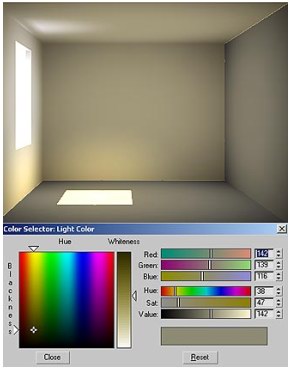 Ambient only R= 142 G=139 B=116 Example 2: The color of a room with a bigger openning
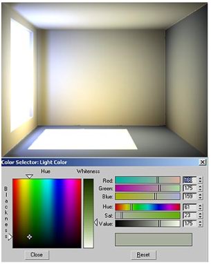 Ambient only R= 168 G=175 B=159
If we have any downlights or diffusers in the room, the skylight and sunlight are still considered stronger. If I give skylight multiplier = 1, the multipier of downlighs or any diffusers should be less. I always start creating lights whose multiplier is the strongest first.
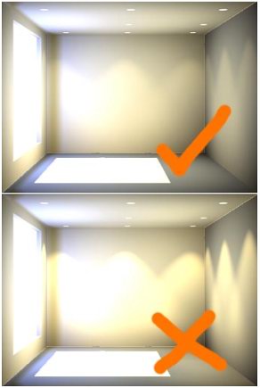 The 2nd picture shows that the multiplier of skylight is equal or lesser than downlights.
Example 3: The color of atmosphere of a room without natural light. Suppose the color or these down light is yellow.
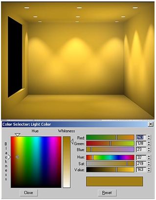 Ambient only R = 163 G =128 B = 23
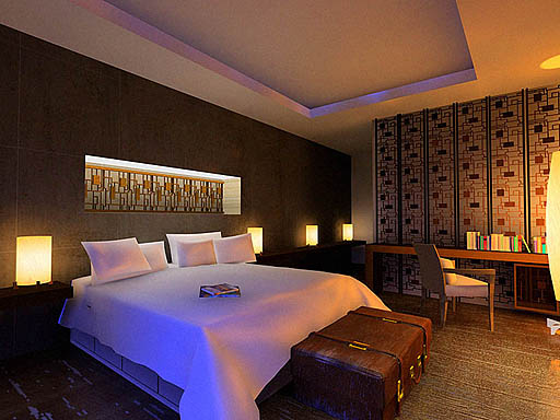
Example 4: The color of atmosphere of a room without natural light as well, but the light sources are more diffuse.
 Ambient only R = 138 G =143 B = 117
Another interesting way to understand how to use color to make our renderings look better and more colorful is to understand color theory. I have read a number of books about painting written by artists. They always try to avoid black and grey becuase this causes images to look dead and colorless. Complimentary color is also interesting. An artist (I am sorry that I don’t remember his name) says “Cool light(color) warm shadow(color) and warm light cool shadow.” I am not too sure if this conflicts with our present science theory but as long as your work turns out very well and you call it “Art” , nothing is right or wrong. For example, if we see orange and blue (complemantary colors), you may think about evening time, as the color of sunlight appear orange in the evening and the ambient light is blue. Another example that is yellow and purple, yellow light goes well with purple ambient light.
 Example 5: The scene is filled with blue and orange light
(c) Montree T. , Smoke3dStudio
Pages: 1 2


Latest Comments